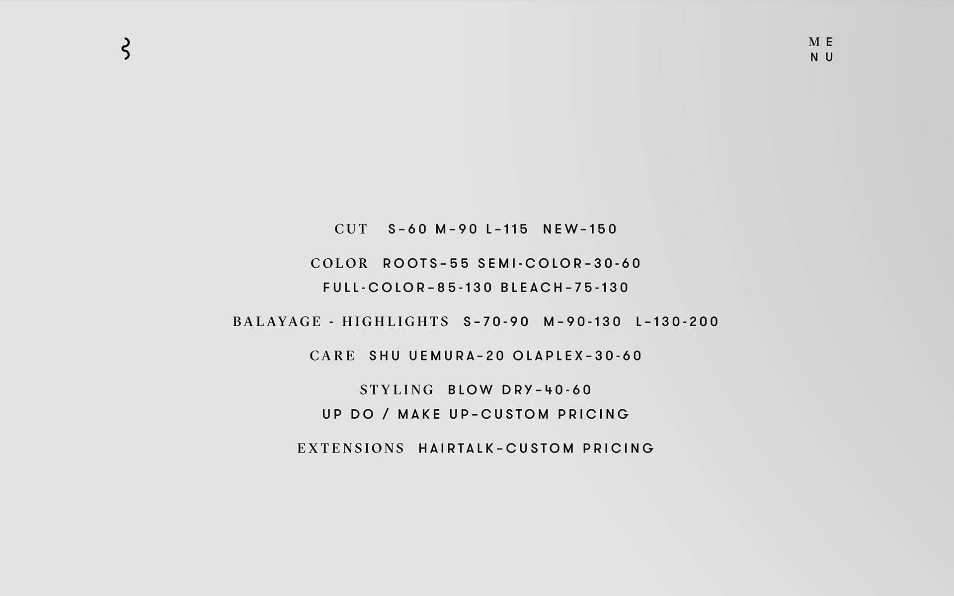
The LOGO is inspired by the B of the protagonist Bailas, a strand of his guests' hair and the different perspectives when both communicate with each other in the studio, either directly or indirectly through the mirror. Depending on the view of the signet, one can not only recognize a B and a strand of hair, but also two connected C's, which stand for Contemporary Coiffure.
As an element of a dynamic communication concept, the word mark can adapt to any medium. Its size is defined by the specific communication medium.
Specially selected business papers with individual embossing underline the EXCLUSIVE claim of the brand and round off the experience in the studio.
The corporate design is characterised by the combination of clear, minimalist design and the use of high-quality materials with exclusive finishes. By using different coloured foil cuts, business cards are created which can be selected according to the hair colour of the recipient.
The GT Sectra font (from Grilli Type) ensures good readability and convinces with clear cuts in its curves for a concisely typeface. Together with GT Walsheim (also Grilli Type), this results in a contemporary typeface with a high aesthetic effect and exclusive touch.
BLACK stands for elegance, confidence, timelessness and coolness. In addition, metallic shades in silver, which symbolise a mirror, and the colours gold, copper and platinum, which are reminiscent of individual hair colours, are used as accent colours.
With the both simple and central message "The new black is coming", the launch campaign starts as a window taping of the new studio at the beginning of the renovation phase. With the successive expansion to other means of communication, the campaign creates above all excitement and draws the attention of the relevant target group to the new brand and the studio on site. Just in time for the opening, the message changes to "I'm the new black" to lead over to the brand message of Bailas CC.
"Hey honey, sitting at Apostolos right now giving me a new haircut. You should make an appointment and get pampered.“ In the area of recommendation marketing, the postcard can be used to draw attention to the atelier and the sender has an introduction for a new story about his new look.
STATE OF THE ART, responsive and reduced to the essential. Bailas.de informs visitors to the site about the brand's special concept, provides insights into the studio, shares stories from various fashion shows where Apostolos is booked and provides transparent information about its prices and services.
SERVICES
IDENTITY, CONSULTING, BRAND STRATEGY, BRAND STORY, BRANDING, BRAND DESIGN, BRAND COMMUNICATION, DIGITAL DESIGN
TEAM
CONSULTING—MATTHIAS BERGHOFF
DESIGN—ANASTASIOS KOUPANTSIS
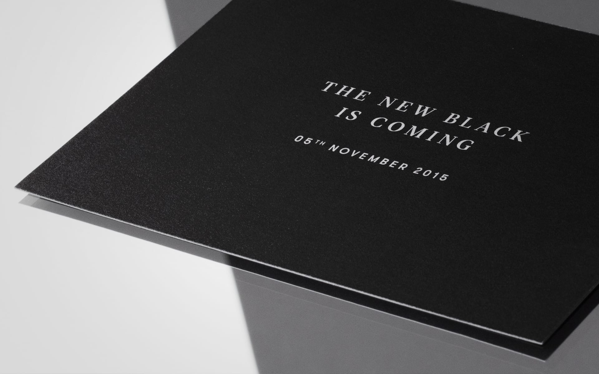
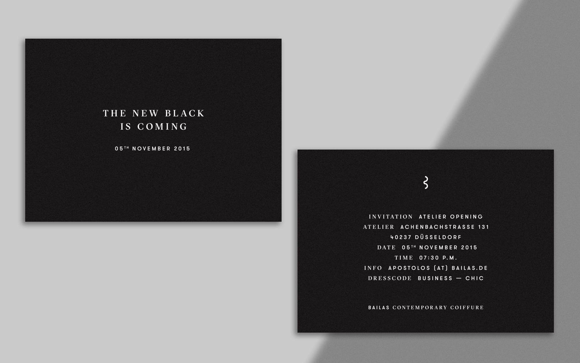
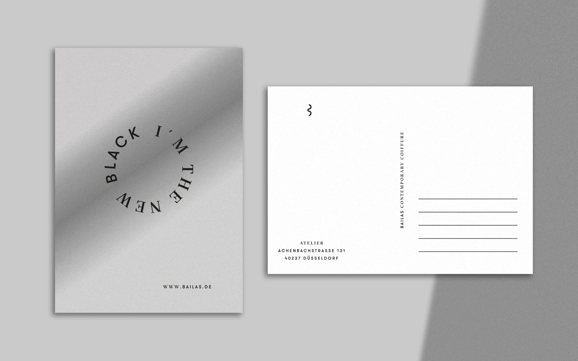
PRINT
LETTERPRESS 77, BUCHBINDEREI MERGEMEIER
PRESS
DESIGN MADE IN GERMANY, IGNANT, LOS LOGOS 8, PAGE MAGAZINE
TALK
ALLIANZ DEUTSCHER DESIGNER, TYPO BERLIN 2016
The LOGO is inspired by the B of the protagonist Bailas, a strand of his guests' hair and the different perspectives when both communicate with each other in the studio, either directly or indirectly through the mirror. Depending on the view of the signet, one can not only recognize a B and a strand of hair, but also two connected C's, which stand for Contemporary Coiffure.
As an element of a dynamic communication concept, the word mark can adapt to any medium. Its size is defined by the specific communication medium.
Specially selected business papers with individual embossing underline the EXCLUSIVE claim of the brand and round off the experience in the studio.
The corporate design is characterised by the combination of clear, minimalist design and the use of high-quality materials with exclusive finishes. By using different coloured foil cuts, business cards are created which can be selected according to the hair colour of the recipient.
The GT Sectra font (from Grilli Type) ensures good readability and convinces with clear cuts in its curves for a concisely typeface. Together with GT Walsheim (also Grilli Type), this results in a contemporary typeface with a high aesthetic effect and exclusive touch.
BLACK stands for elegance, confidence, timelessness and coolness. In addition, metallic shades in silver, which symbolise a mirror, and the colours gold, copper and platinum, which are reminiscent of individual hair colours, are used as accent colours.
With the both simple and central message "The new black is coming", the launch campaign starts as a window taping of the new studio at the beginning of the renovation phase. With the successive expansion to other means of communication, the campaign creates above all excitement and draws the attention of the relevant target group to the new brand and the studio on site. Just in time for the opening, the message changes to "I'm the new black" to lead over to the brand message of Bailas CC.
"Hey honey, sitting at Apostolos right now giving me a new haircut. You should make an appointment and get pampered.“ In the area of recommendation marketing, the postcard can be used to draw attention to the atelier and the sender has an introduction for a new story about his new look.
STATE OF THE ART, responsive and reduced to the essential. Bailas.de informs visitors to the site about the brand's special concept, provides insights into the studio, shares stories from various fashion shows where Apostolos is booked and provides transparent information about its prices and services.
© 2020 BETTY + BETTY