


The logo, as the central sender of communication, picks up the vision and the core of SCALE: the successive change, adaptation and enlargement of the platform. For this purpose, the signet combines the scaling axes X and Y as an abstract association. Depending on the medium and content, the logo elements are used as a signet, word/figurative mark or as a design bracket.


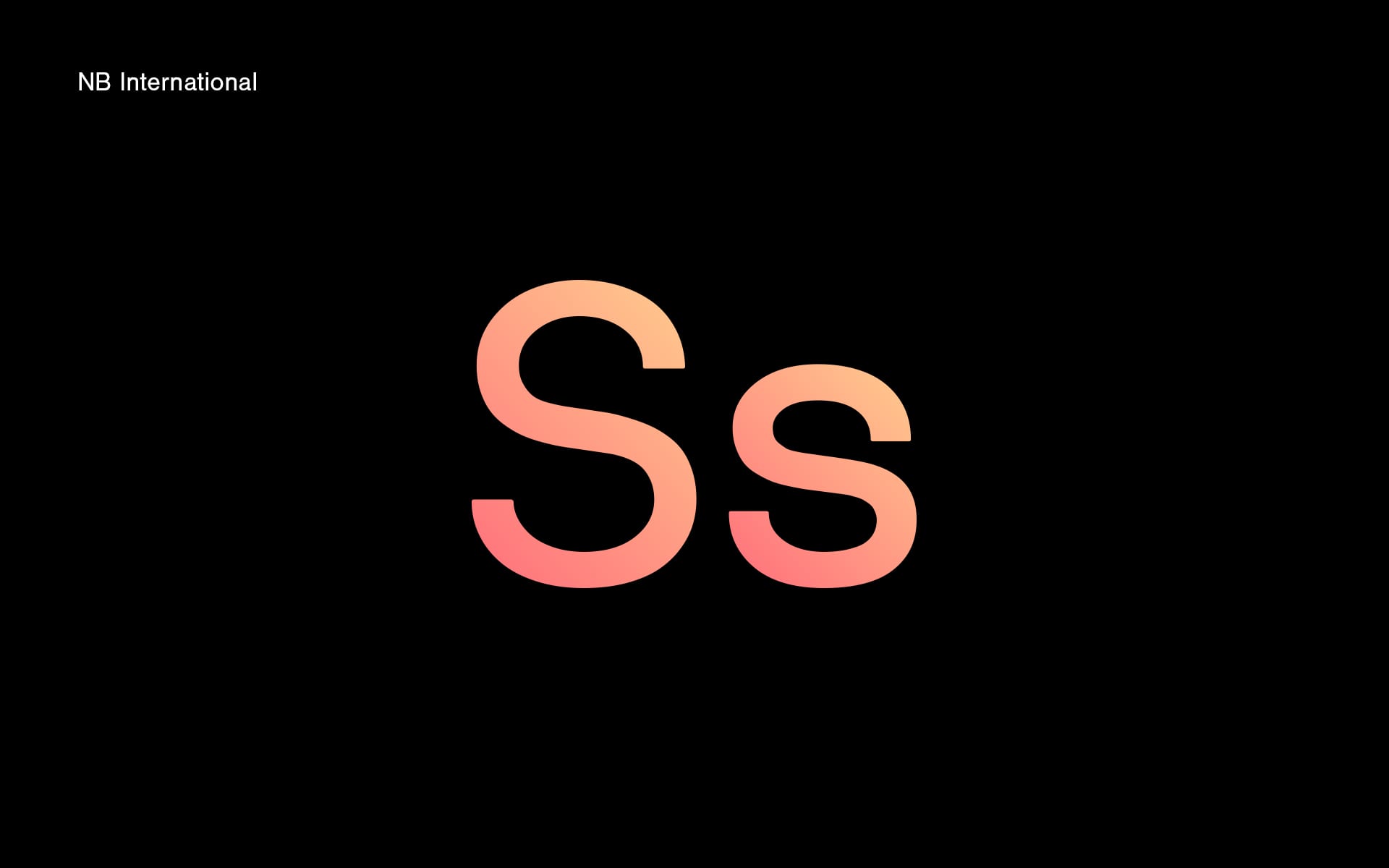

Striking and self-confident: the typeface NB International, developed by the Design Studio Neubau Berlin, has a modern look and, due to its curves, is soft and harmonious at the same time. This gives it its special character.
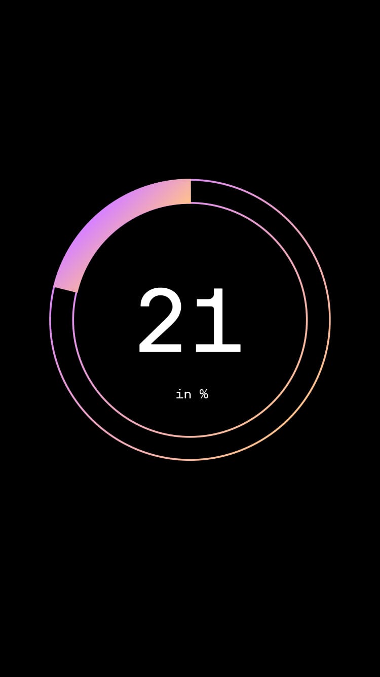
The colour spectrum takes up the EnBW basic colours "orange" and "blue" in a light, modern and future-oriented colour scheme. As first and last colour they form the frame in which SCALE works. Within the colours, the dynamic process of SCALE is made clear through colour gradients.


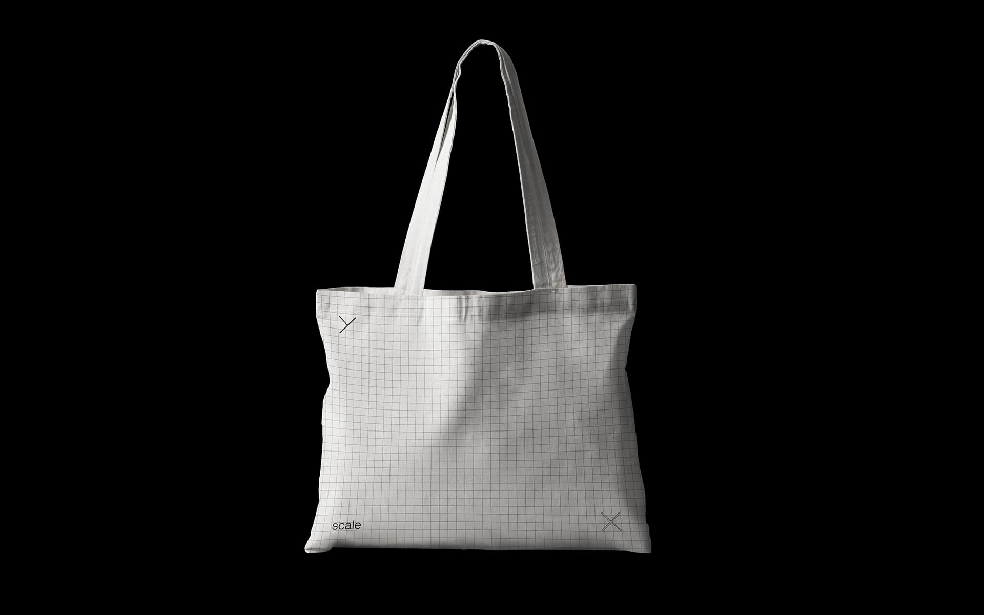
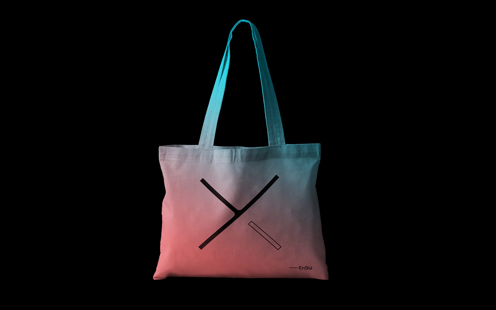


Employees who are to work with the digital platform in the future will be brought into contact with SCALE via various communication tools in order to get to know the product and integrate it into their daily work. The dynamic design concept takes up the agility of the platform and can be adapted to new topics within SCALE and to different media as required. The basic message is always guaranteed.


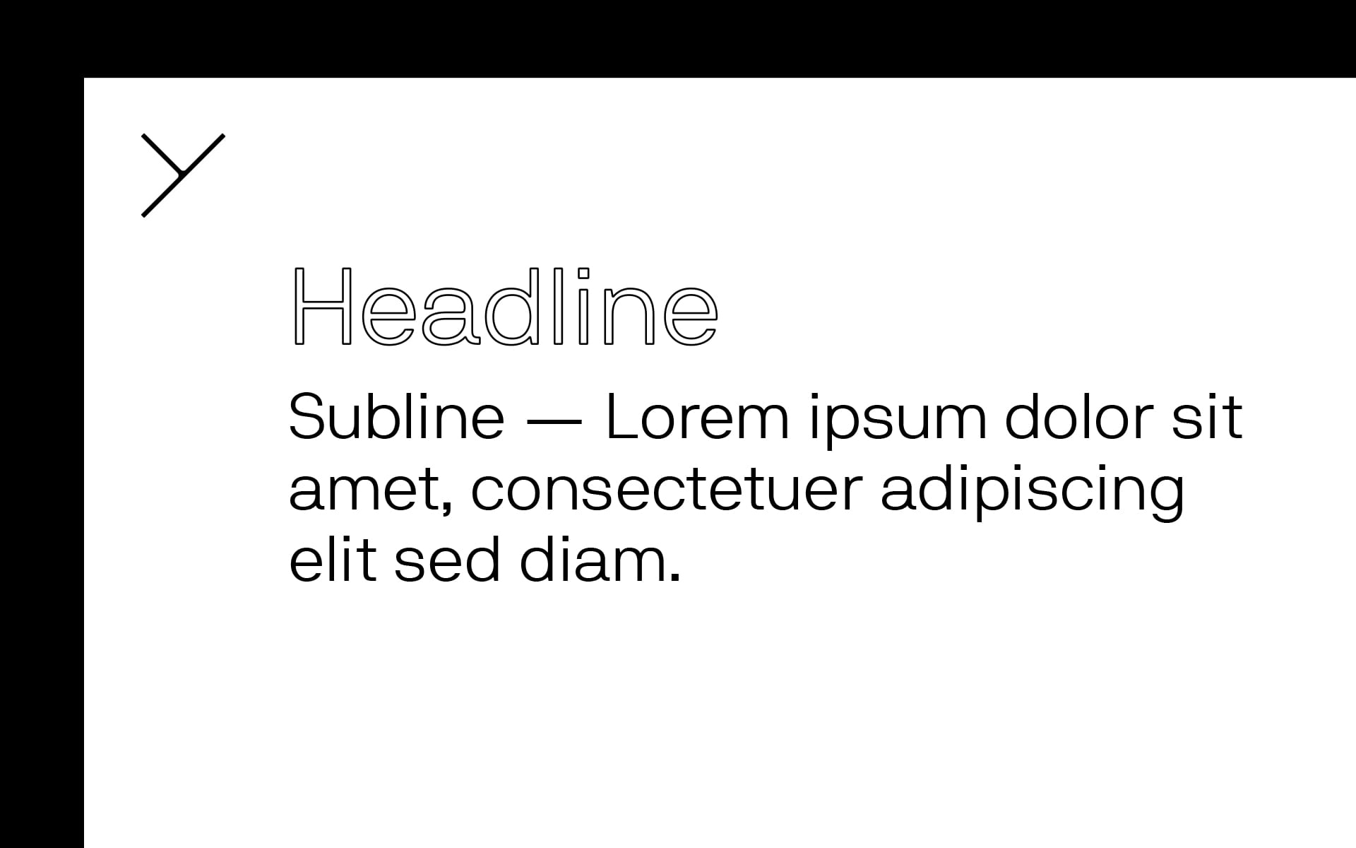


With the Power-Point-Master, all project participants have the opportunity to present current topics in a concise and differentiated manner according to individual areas with a clear sender and their own tonality. Various colour gradients help to differentiate between chapters or individual aspects within the processing platform.
SERVICES
CONSULTING, Branding, Brand Communication
TEAM
CONSULTING—Matthias Berghoff
DESIGN—Iga Alberska, Anastasios Koupantsis
← BACK TO PROJECTS


The logo, as the central sender of communication, picks up the vision and the core of SCALE: the successive change, adaptation and enlargement of the platform. For this purpose, the signet combines the scaling axes X and Y as an abstract association. Depending on the medium and content, the logo elements are used as a signet, word/figurative mark or as a design bracket.


Striking and self-confident: the typeface NB International, developed by the Design Studio Neubau Berlin, has a modern look and, due to its curves, is soft and harmonious at the same time. This gives it its special character.
The colour spectrum takes up the EnBW basic colours "orange" and "blue" in a light, modern and future-oriented colour scheme. As first and last colour they form the frame in which SCALE works. Within the colours, the dynamic process of SCALE is made clear through colour gradients.



Employees who are to work with the digital platform in the future will be brought into contact with SCALE via various communication tools in order to get to know the product and integrate it into their daily work. The dynamic design concept takes up the agility of the platform and can be adapted to new topics within SCALE and to different media as required. The basic message is always guaranteed.


With the Power-Point-Master, all project participants have the opportunity to present current topics in a concise and differentiated manner according to individual areas with a clear sender and their own tonality. Various colour gradients help to differentiate between chapters or individual aspects within the processing platform.
© 2020 BETTY + BETTY
© 2020 BETTY + BETTY