
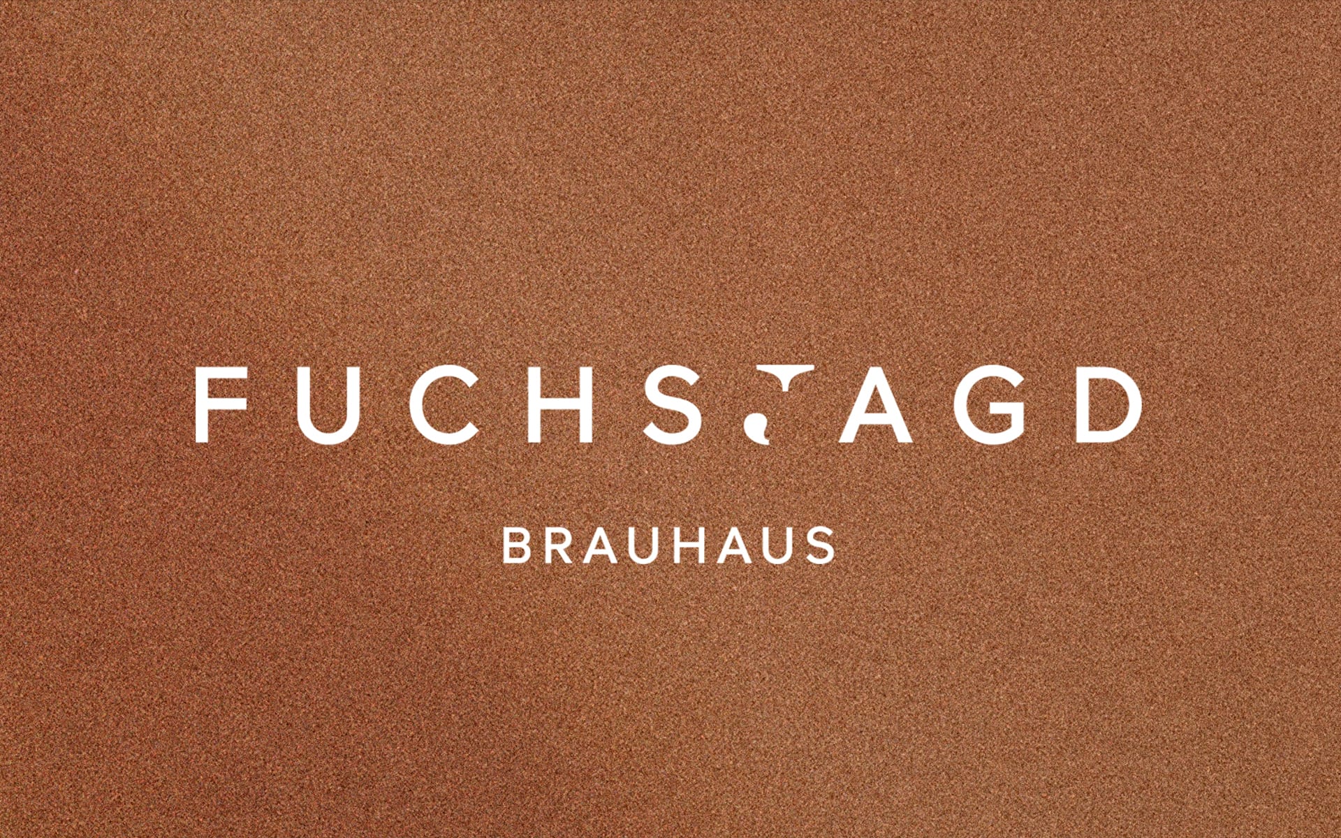
In the new Fuchsjagd logo, tradition and modernity merge by combining fonts with and without serifs. The "J" in serif forms the core in the centre as a symbol of the brewhouse tradition and is framed by modern sans-serif type. In addition, it is deconstructed in such a way that it simultaneously shows the distinctive features of the fox in the shape of its head and tail and leads directly to the history of the fox hunt.
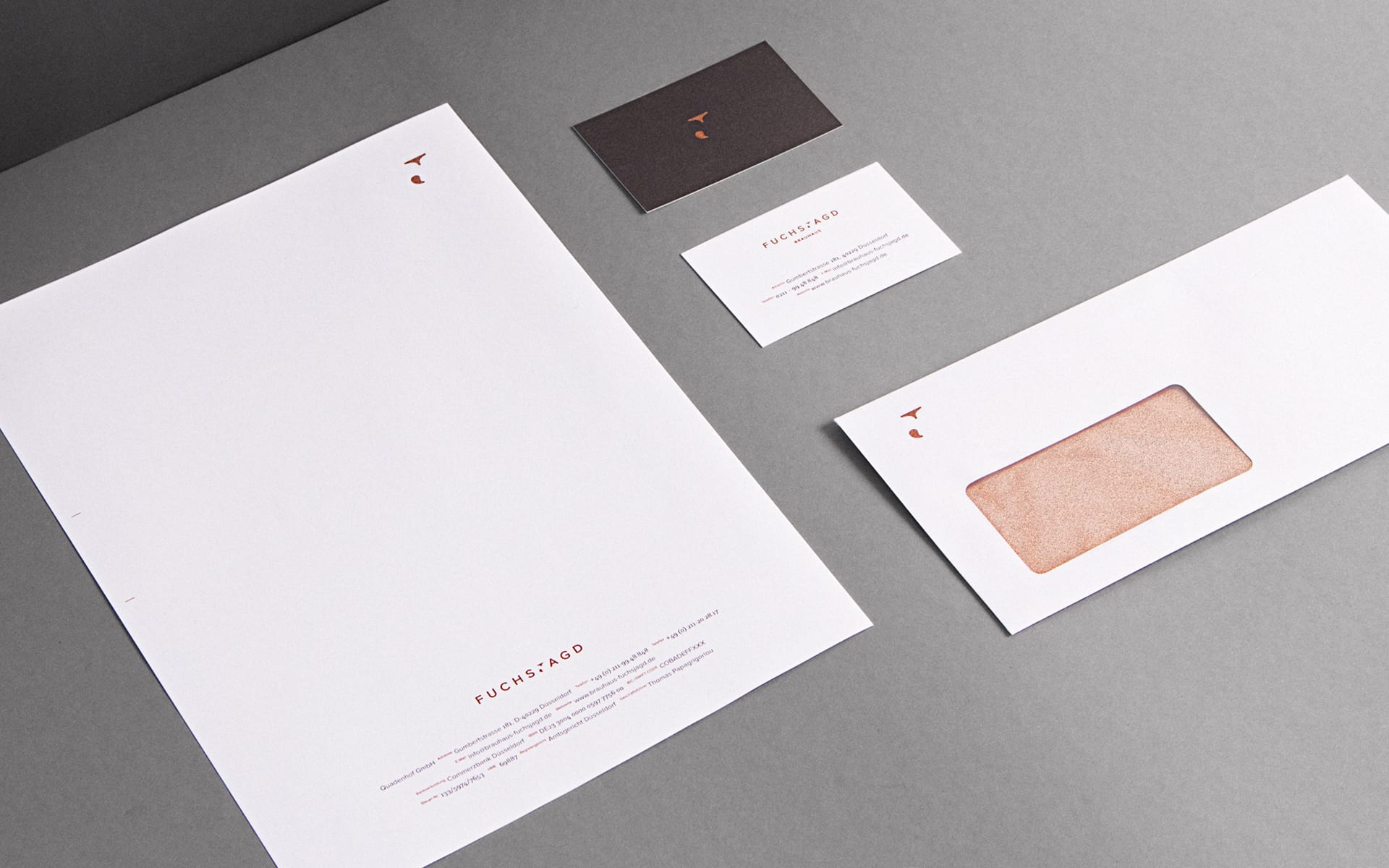


The signet as a central element is used on every communication medium. After all, it is all about hunting the fox, searching and finding it. That is why you never see him completely and never in the same place. The signet is sometimes in the middle, sometimes left or right.


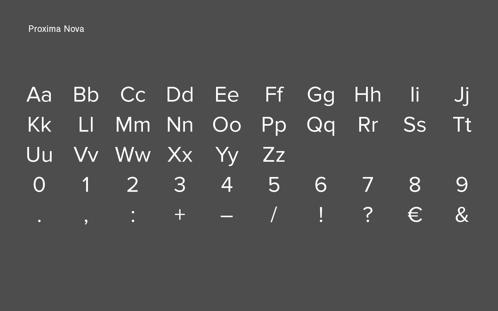


Proxima Nova is a contemporary typeface that combines modern proportions with a geometric appearance, making it suitable for both analog and digital use. Clavo adds a certain warmth to the typeface through its subtle details, so that the combination of the two typefaces also brings out the modern brewhouse character of the fox hunt in typography.
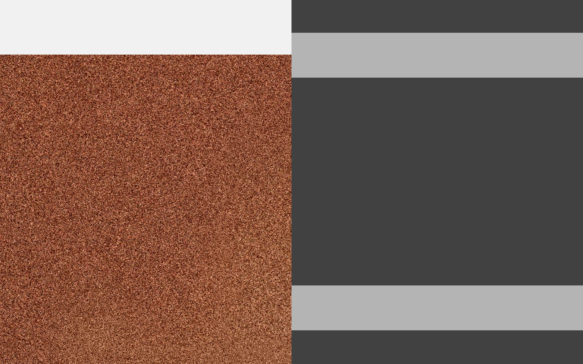
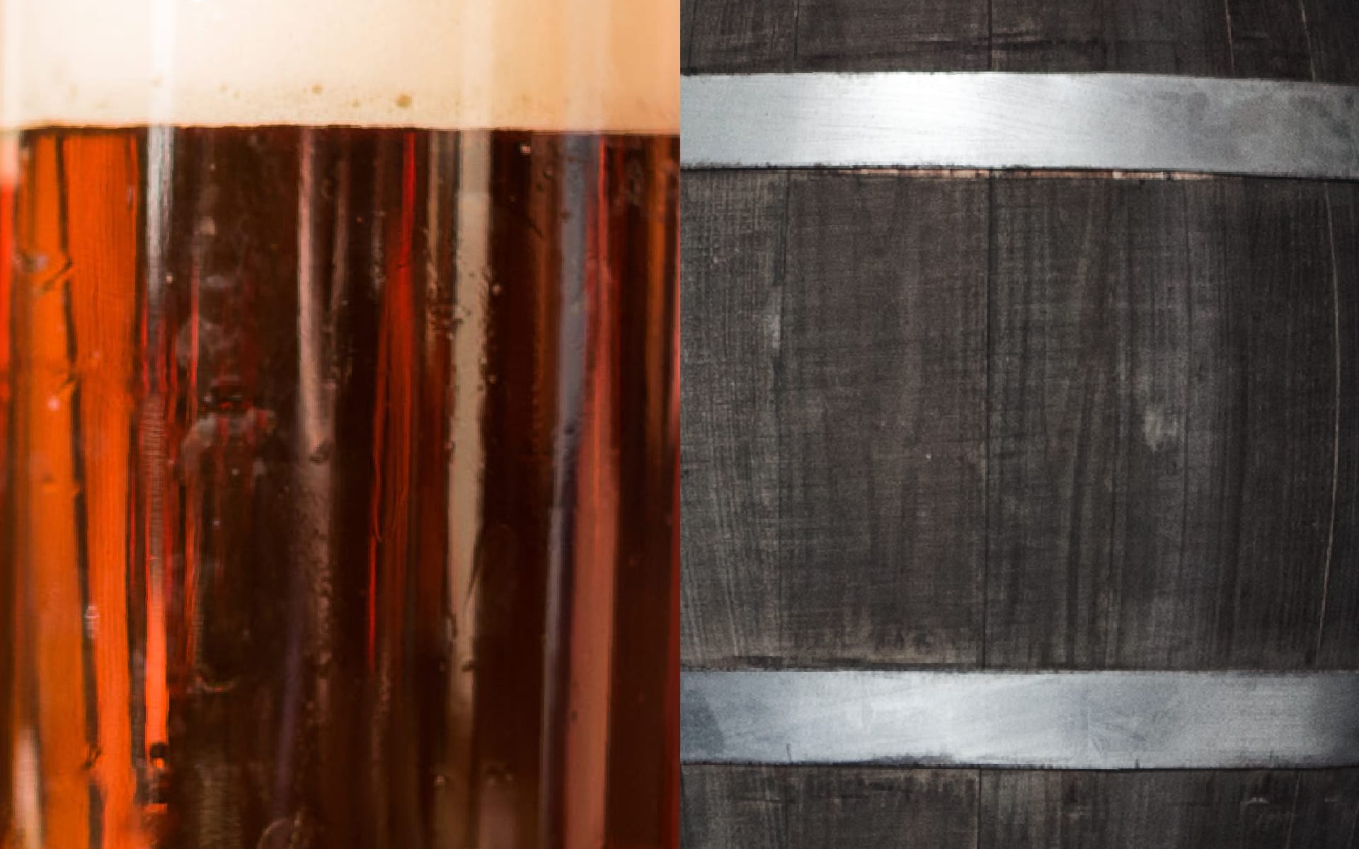
Copper as a primary colour is reminiscent of the reddish-brown fur color of the fox as well as the brown-red Füchschen-Altbier and the copper kettle in which it is brewed. The contrasting anthracite shades, inspired by iron barrel hoops, complete the color concept. They give the design a high-quality and modern look.

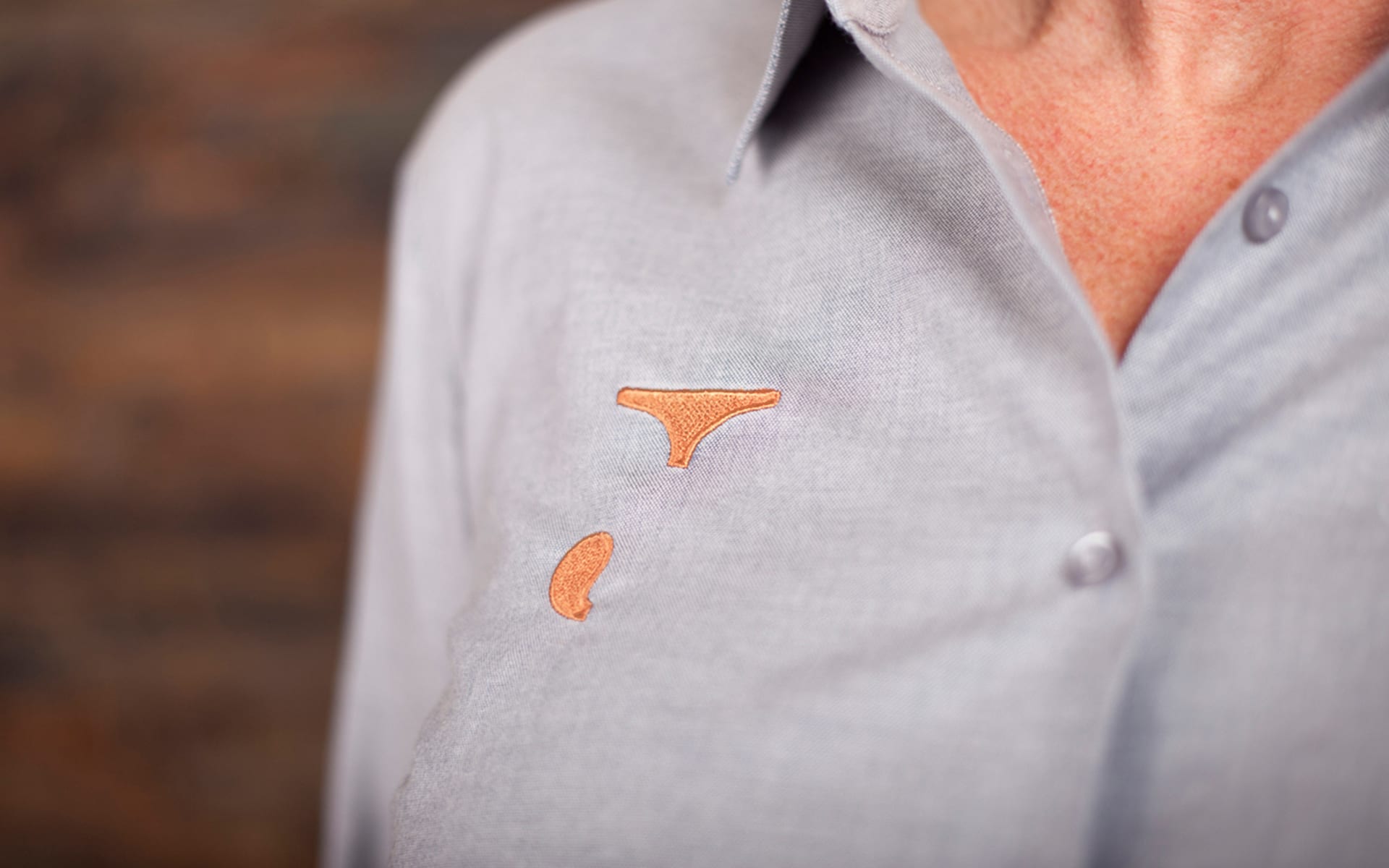


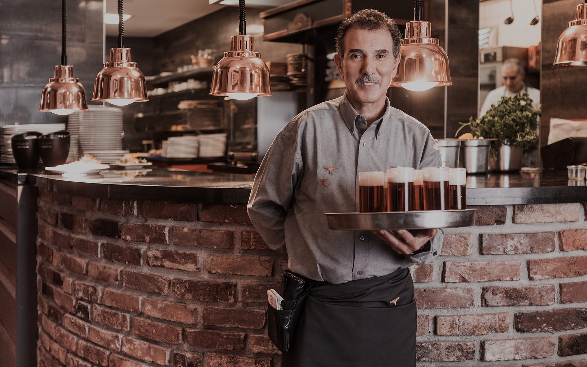
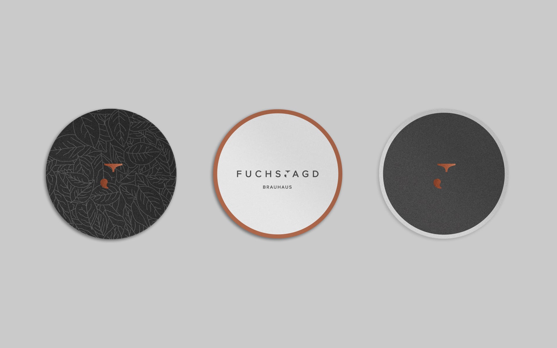
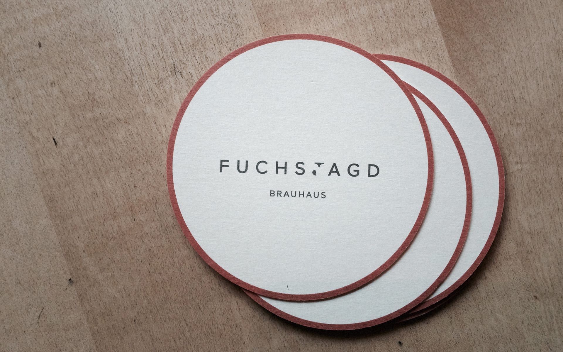
The new corporate design of the brewhouse was implemented across the board, starting with beer mats and napkins, matches, bags and lunch menus and ending with corporate clothing. The clothing concept is designed in such a way that waiters, head waiters as well as kitchen assistants, cooks and chefs can be clearly distinguished from each other, thus creating a differentiated yet homogenous image of all Fuchsjagd employees.


The menu is the central communication tool of a restaurant business and should, in contrast to a simple price catalogue of the dishes offered, reflect the philosophy of the business and its performance. Analogous to the concept of hunting, the guest goes on a search while reading the menu. He is accompanied by small hints on his hunt and can discover old and new delicacies. Two integrated rubber bands ensure that the menu remains flexible in its handling, can be changed at short notice, special actions and events can be announced and there is the possibility to integrate the weekly changing lunch menu into the menu.
SERVICES
BRAND Story, Branding, Brand Communication, EDITORIAL DESIGN
TEAM
CONSULTING—Matthias Berghoff
DESIGN—Anastasios Koupantsis
PRODUCTION
Backes Druck, Buchbinderei Mergemeier
AWARDS
ADC GERMANY—Special Mention, Logodesign
GERMAN DESIGN AWARD—Special Mention, Corporate Identity
GERMAN BRAND AWARD—Nominee, Corporate Identity
BEHANCE—Appreciation, Branding
PRESS
DESIGN MADE IN GERMANY, MINIMAL STUFF MAGAZINE
TALKS
AGD DÜSSELDORF, TYPO BERLIN



In the new Fuchsjagd logo, tradition and modernity merge by combining fonts with and without serifs. The "J" in serif forms the core in the centre as a symbol of the brewhouse tradition and is framed by modern sans-serif type. In addition, it is deconstructed in such a way that it simultaneously shows the distinctive features of the fox in the shape of its head and tail and leads directly to the history of the fox hunt.


The signet as a central element is used on every communication medium. After all, it is all about hunting the fox, searching and finding it. That is why you never see him completely and never in the same place. The signet is sometimes in the middle, sometimes left or right.


Proxima Nova is a contemporary typeface that combines modern proportions with a geometric appearance, making it suitable for both analog and digital use. Clavo adds a certain warmth to the typeface through its subtle details, so that the combination of the two typefaces also brings out the modern brewhouse character of the fox hunt in typography.


Copper as a primary color is reminiscent of the reddish-brown fur colour of the fox as well as the brown-red Füchschen-Altbier and the copper kettle in which it is brewed. The contrasting anthracite shades, inspired by iron barrel hoops, complete the color concept. They give the design a high-quality and modern look.
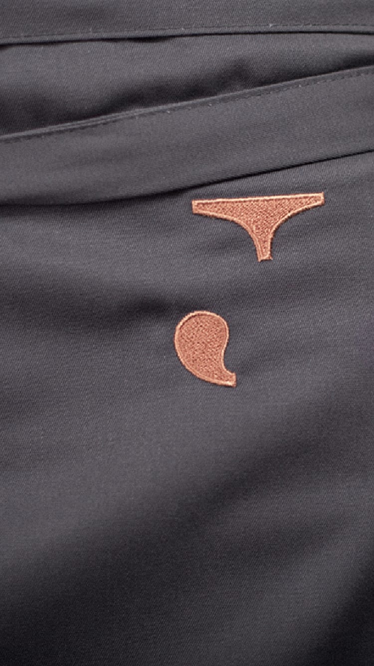


The new corporate design of the brewhouse was implemented across the board, starting with beer mats and napkins, matches, bags and lunch menus and ending with corporate clothing. The clothing concept is designed in such a way that waiters, head waiters as well as kitchen assistants, cooks and chefs can be clearly distinguished from each other, thus creating a differentiated yet homogenous image of all Fuchsjagd employees.


The menu is the central communication tool of a restaurant business and should, in contrast to a simple price catalogue of the dishes offered, reflect the philosophy of the business and its performance. Analogous to the concept of hunting, the guest goes on a search while reading the menu. He is accompanied by small hints on his hunt and can discover old and new delicacies.
© 2020 BETTY + BETTY
© 2020 BETTY + BETTY