BST works between 2D (design, draft) and 3D (finished building). On the way to the finished building, BST always incorporates several perspectives into the project - the needs of the users, the requirements of the client and the architects' own demands. Isometry combines 2D and 3D as a graphic form of representation and, in a simplified form, forms the framework for the design concept. Within this framework, among other things, isometric letters have been created, which are repeatedly rearranged depending on the content and medium and thus symbolise the different perspectives.
The various aspects of the story are reflected not only in the key visual, but in the entire corporate design. The individual letters can be displayed differently as key visuals on each means of communication and thus frame the respective content. In addition, the underlying grid determines the design or is even integrated as a design element in individual communication tools. To illustrate the different perspectives, entire text blocks with different reading and viewing directions are arranged on particular communication media. The theme is also carried on the business cards via the photos of the individual actors.
The new typeface underlines the identity of BST. Maison Neue (by Milieu Grotesque) is a contemporary grotesque typeface with a harmonious effect. Maison Neue Mono complements the typeface in the display of numbers and calculated values.
The reduced design with different shades of grey provides the necessary contrast to draw attention to the content: the actors, the architecture and its details.
A dynamic document folder can be compiled again and again for presentations and acquisition. Depending on the project, the predefined cases can be selected and inserted and thus special needs can be met.
In addition to business equipment, smaller accessories such as bags or coffee cups allow identity to become visible in everyday life and in conversations with clients.
The contemporary website presents various content topics in a clear and varied manner with the help of the minimalist design. The topic of the different points of view is taken up again with detailed process descriptions, matching project examples as well as personal statements of the BST team.
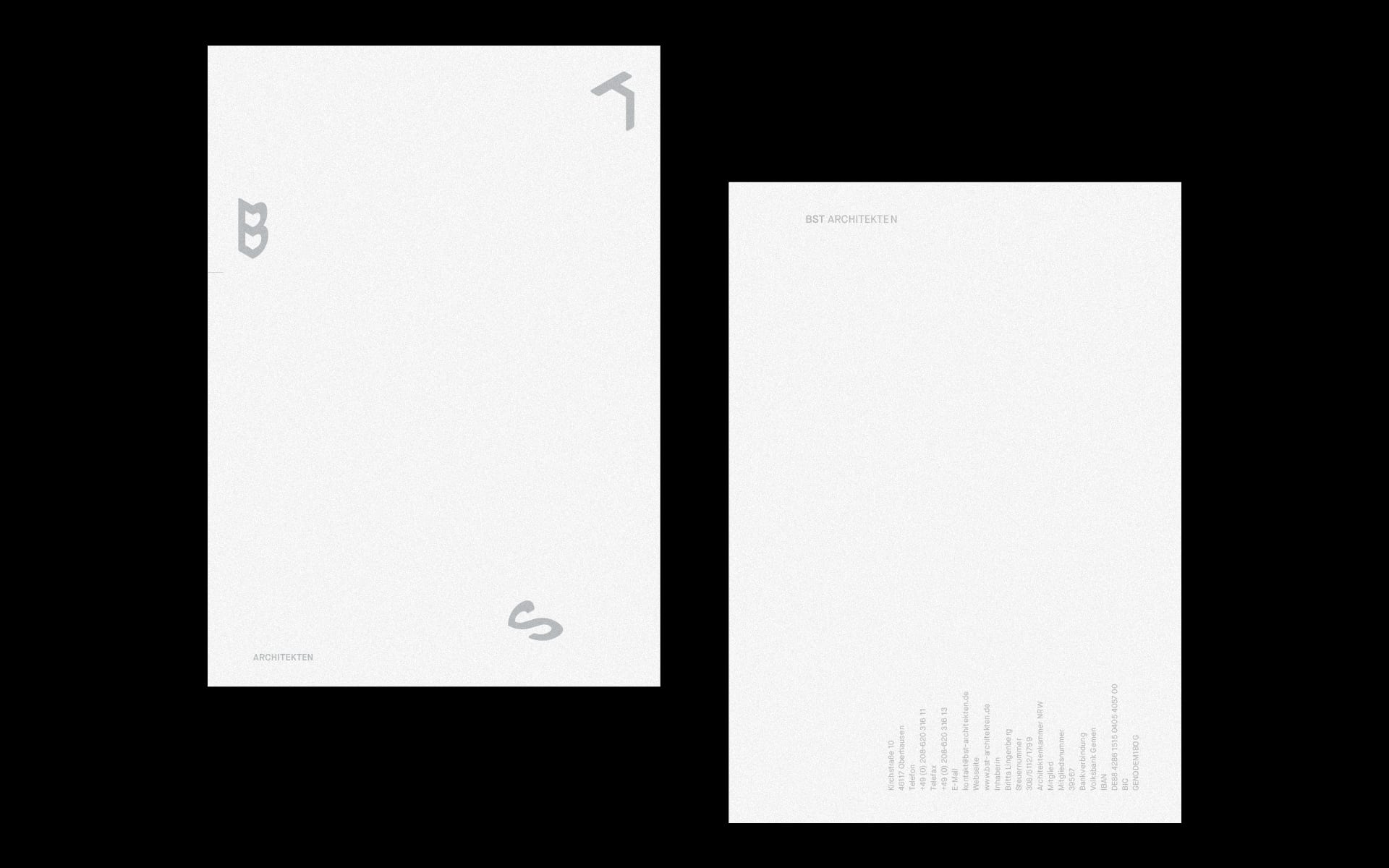
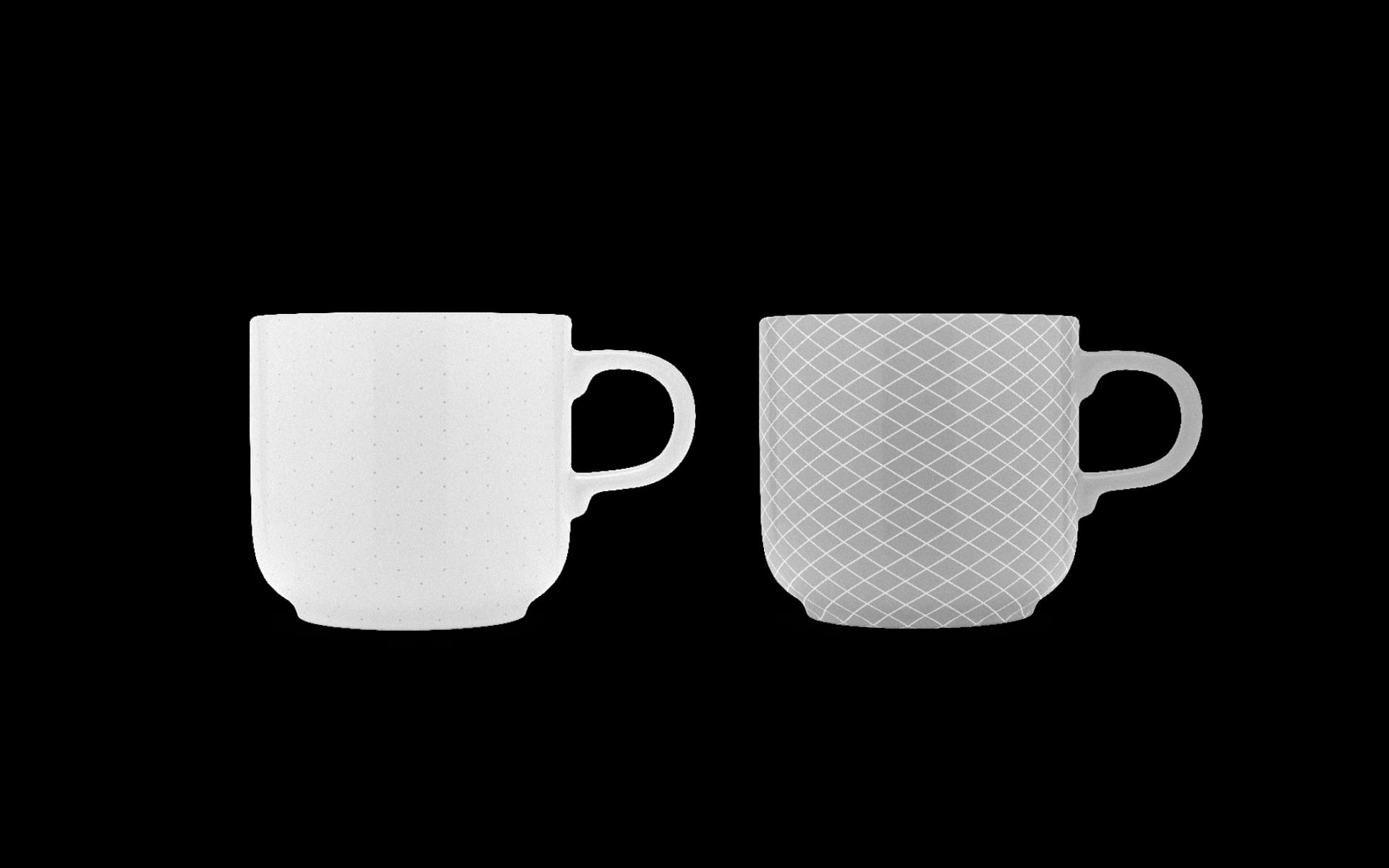
IdentitY, BRAND STRATEGY, Corporate Design, Digital Design, Editorial Design
TEAM
CONSULTING—Matthias Berghoff
DESIGN—Anastasios Koupantsis, Johannes Winkler
AWARDS
ART DIRECTORS CLUB GERMANY—SPECIAL MENTION, Logo Design
ART DIRECTORS CLUB GERMANY—SPECIAL MENTION, Corporate Design
CORPORATE DESIGN PREIS—NOMINEE, Logotype Design
GERMAN DESIGN AWARD—WINNER, Corporate Design
GERMAN BRAND AWARD—WINNER, Corporate Design
PRESS
DESIGN MADE IN GERMANY, THE BRAND IDENTITY, VISUELLE
← BACK TO PROJECTS
BST works between 2D (design, draft) and 3D (finished building). On the way to the finished building, BST always incorporates several perspectives into the project - the needs of the users, the requirements of the client and the architects' own demands. Isometry combines 2D and 3D as a graphic form of representation and, in a simplified form, forms the framework for the design concept. Within this framework, among other things, isometric letters have been created, which are repeatedly rearranged depending on the content and medium and thus symbolise the different perspectives.
The various aspects of the story are reflected not only in the key visual, but in the entire corporate design. The individual letters can be displayed differently as key visuals on each means of communication and thus frame the respective content. In addition, the underlying grid determines the design or is even integrated as a design element in individual communication tools. To illustrate the different perspectives, entire text blocks with different reading and viewing directions are arranged on particular communication media. The theme is also carried on the business cards via the photos of the individual actors..
The new typeface underlines the identity of BST. Maison Neue (by Milieu Grotesque) is a contemporary grotesque typeface with a harmonious effect. Maison Neue Mono complements the typeface in the display of numbers and calculated values.
The reduced design with different shades of grey provides the necessary contrast to draw attention to the content: the actors, the architecture and its details.
A dynamic document folder can be compiled again and again for presentations and acquisition. Depending on the project, the predefined cases can be selected and inserted and thus special needs can be met.
In addition to business equipment, smaller accessories such as bags or coffee cups allow identity to become visible in everyday life and in conversations with clients.
The contemporary website presents various content topics in a clear and varied manner with the help of the minimalist design. The topic of the different points of view is taken up again with detailed process descriptions, matching project examples as well as personal statements of the BST team.
© 2020 BETTY + BETTY