


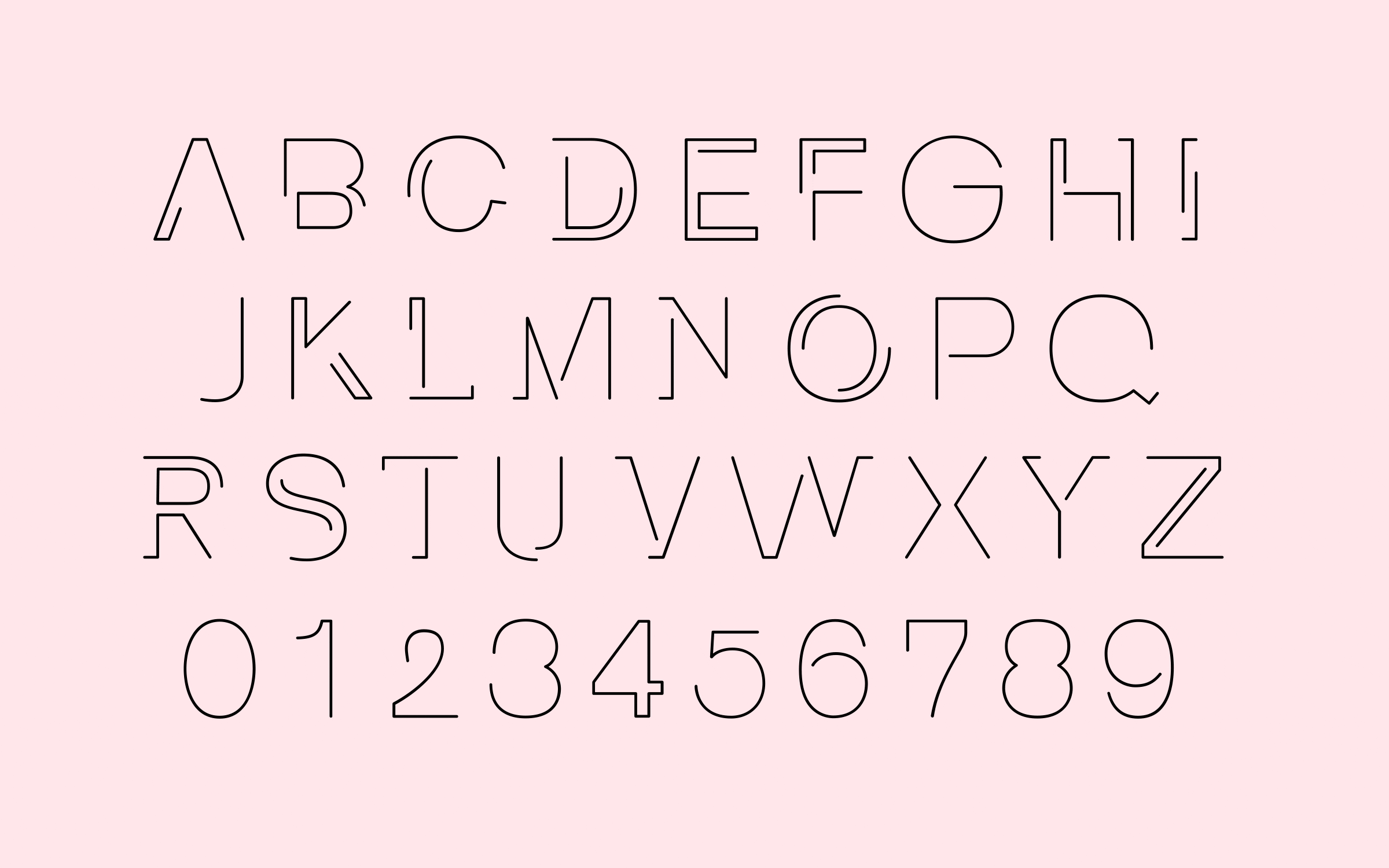


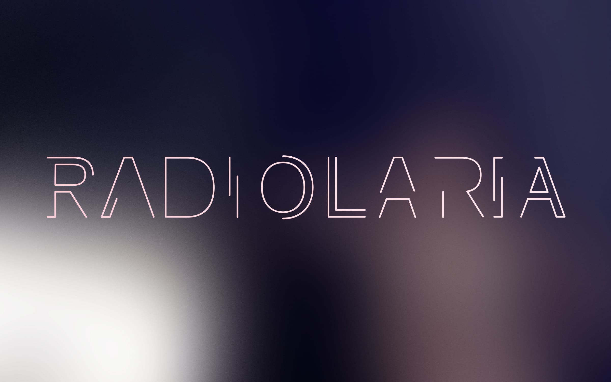


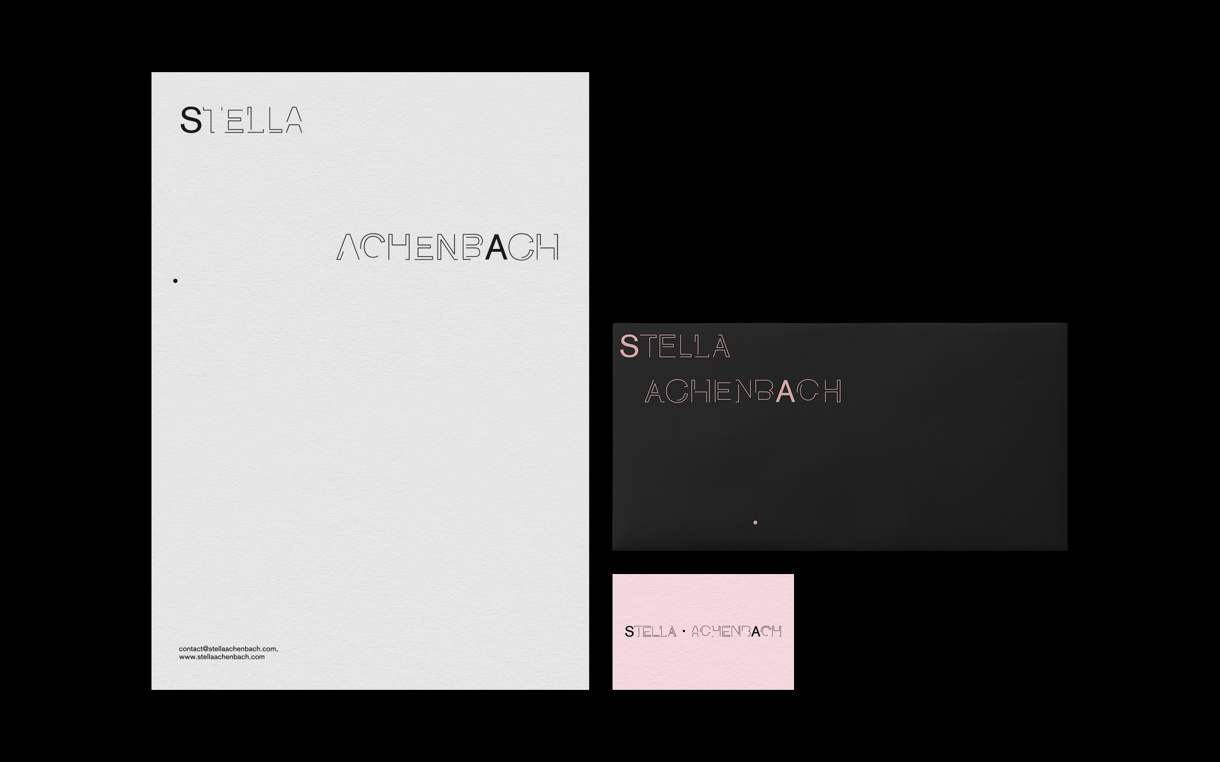


SERVICES
IDENTITY WORKSHOP, CORPORATE DESIGN, CUSTOM TYPE, DIGITAL DESIGN
TEAM
CONSULTING—Matthias Berghoff
DESIGN—Anastasios Koupantsis, FeLIX RABE
← BACK TO PROJECTS


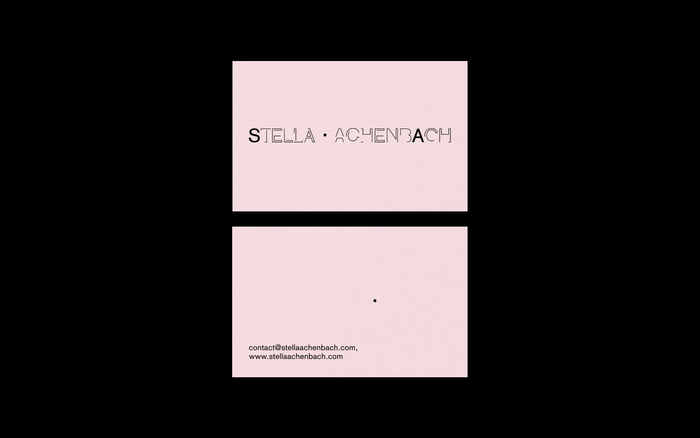
SERVICES
IDENTITY WORKSHOP, CORPORATE DESIGN, CUSTOM TYPE, DIGITAL DESIGN
TEAM
CONSULTING—Matthias Berghoff
DESIGN—Anastasios Koupantsis, FeLIX RABE
← BACK TO PROJECTS